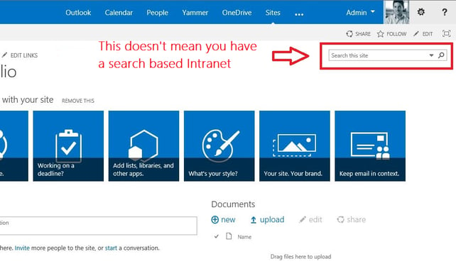
Okay. If you've heard of SharePoint 2013, you've probably heard that one of its greatest improvements over SharePoint 2010 is Search. But, here's the thing. Most people I run into don't know what that means. I can't tell you how many people I've talked to that just assume SharePoint 2013 has a better search engine than it used to. That's true, but not what differentiates the platform from others. SharePoint Intranet design isn't what it used to be, and here's why…

Search is elemental to new SharePoint 2013 Intranets and Intranet design. SharePoint as a platform is fundamentally different than it used to be because of Search. If you're designing a SharePoint 2013 Intranet the way you would have designed a SharePoint 2010 Intranet, you're just doing it wrong. The face of SharePoint Search used to be that little box in the upper right hand corner of sites.
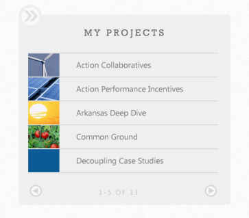
Now, a SharePoint 2013 search based Intranet looks like this:

Or this:

A search based Intranet can look like anything you want it to because of three factors which live completely under the surface for end users:
Managed Navigation
Content Search Web Parts
Using these features will allow you to surface content to users in a cleaner more efficient way that takes way less time to administer.
Check back soon to read the blogs to find out how it's done, or subscribe and get these blogs sent right to your email.
Share